It got a little hotter this year
I was curious to compare this year's miserable heat during the Psummer Psycho 50k to last year's miserable heat. For the first three hours, they were similar, but as the day went on this year became a lot warmer. Then I was curious to see how the increase in temps impacted my pace. It's pretty clear to see how those temps had a significant impact on my third loop.
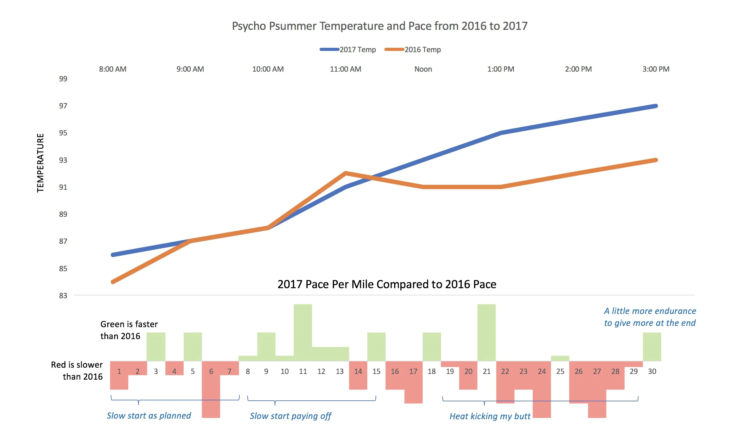
Year over year analysis of the heat and the impact on my pace
Just In Time Reminder
Simple little JIT hack to remember to take home my osso bucco from my trip to the butcher shop over lunch.

Remember to bring home the bacon
Kylo Venn Diagram
Kylo Venn Diagram - using the Death Star and Starkiller Base to highlight the similarities and differences between Star Wars Episode 4: A New Hope and Star Wars Episode 7: The Force Awakens.